Studio AOAO is an interdisciplinary studio combining art and design. It was created by Alicja Strzyzynska and Onur Iseri in Amsterdam in 2020.
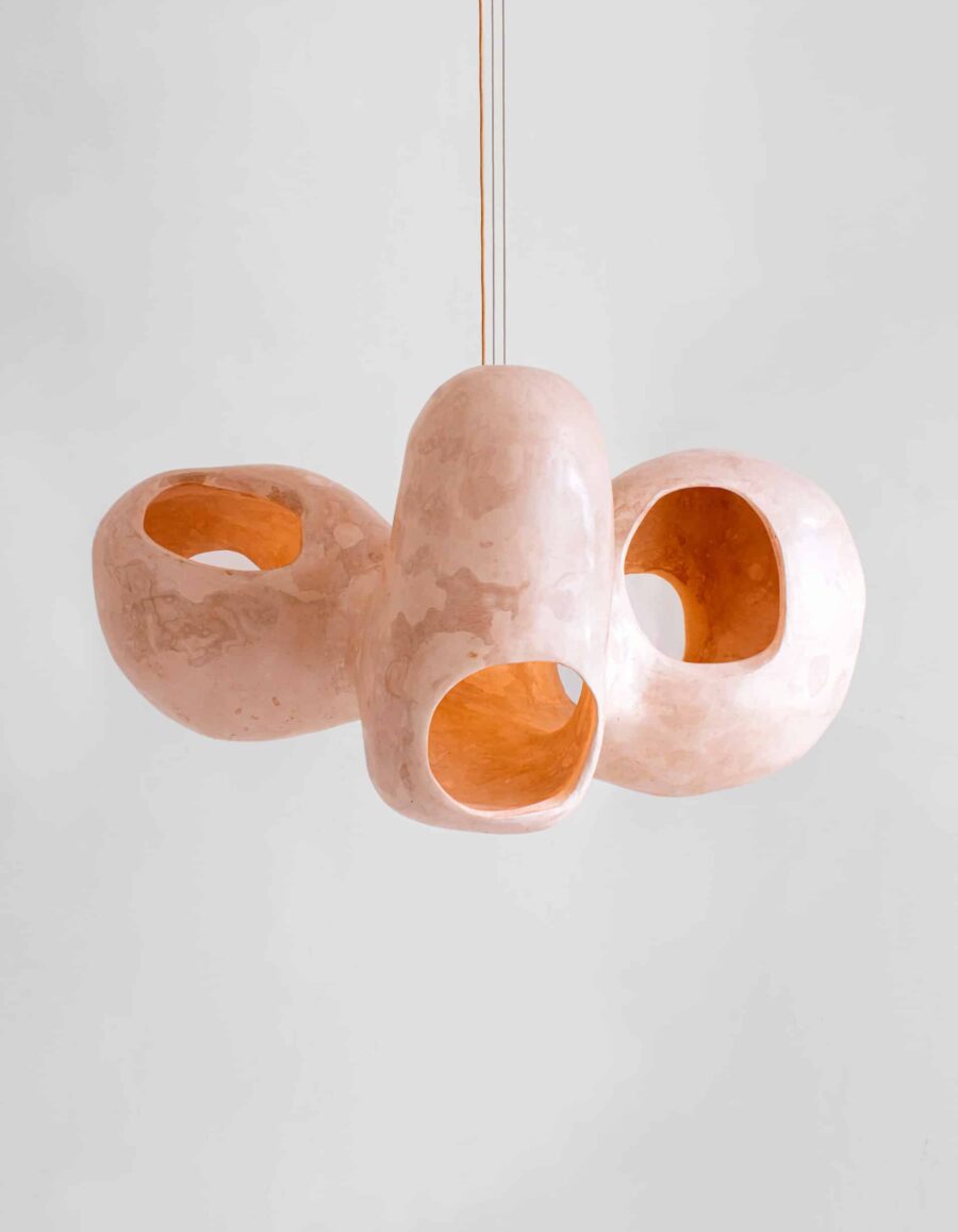
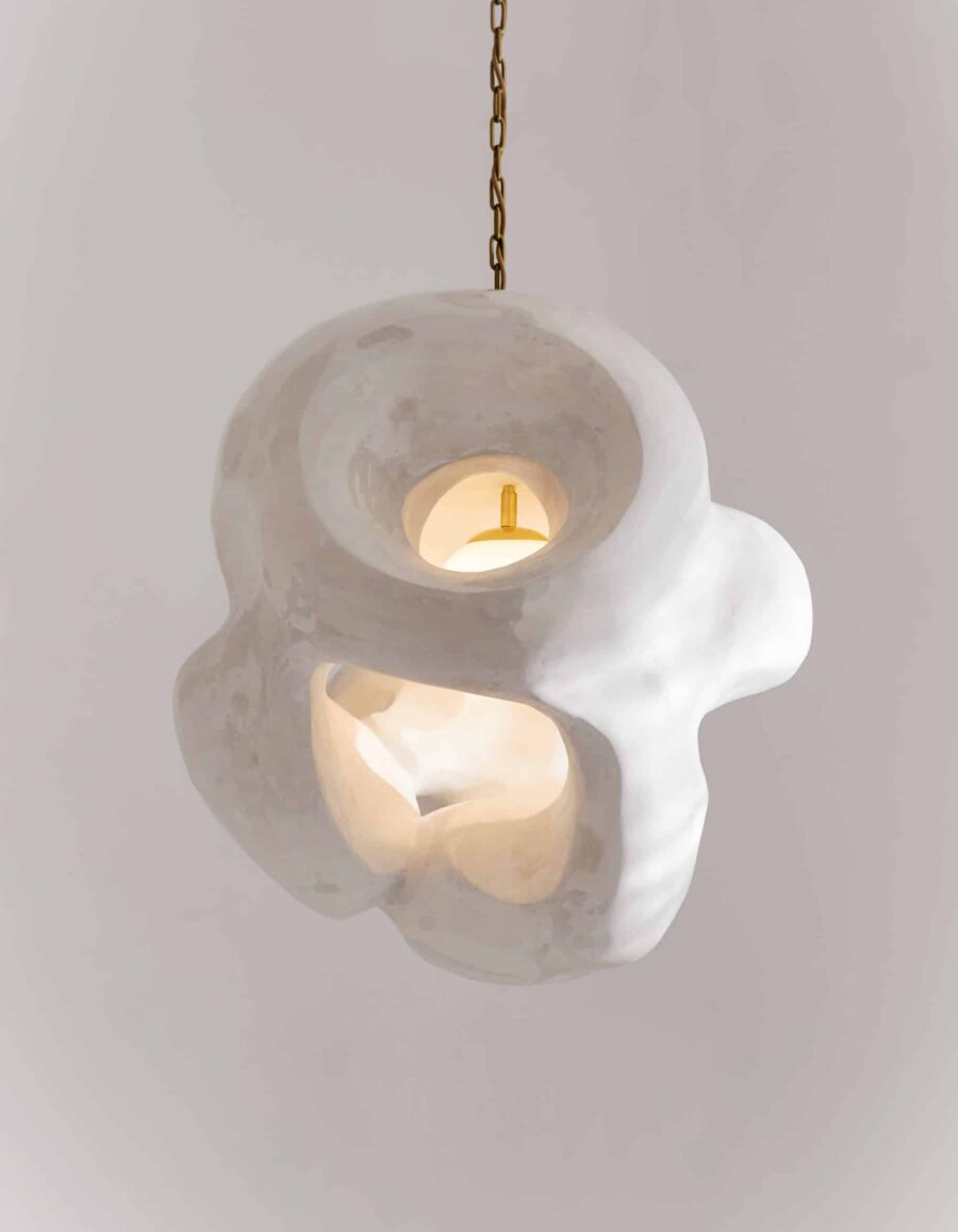
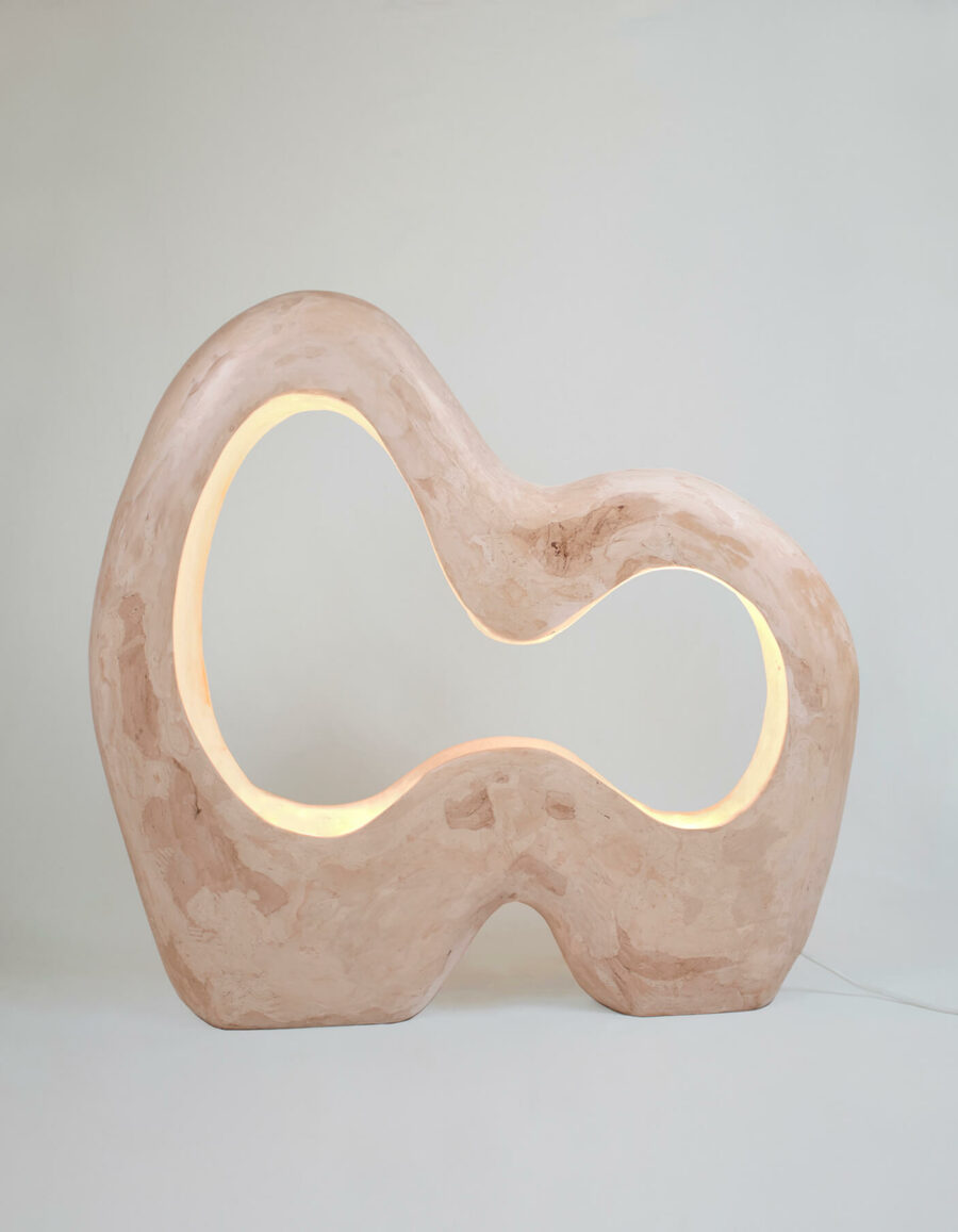
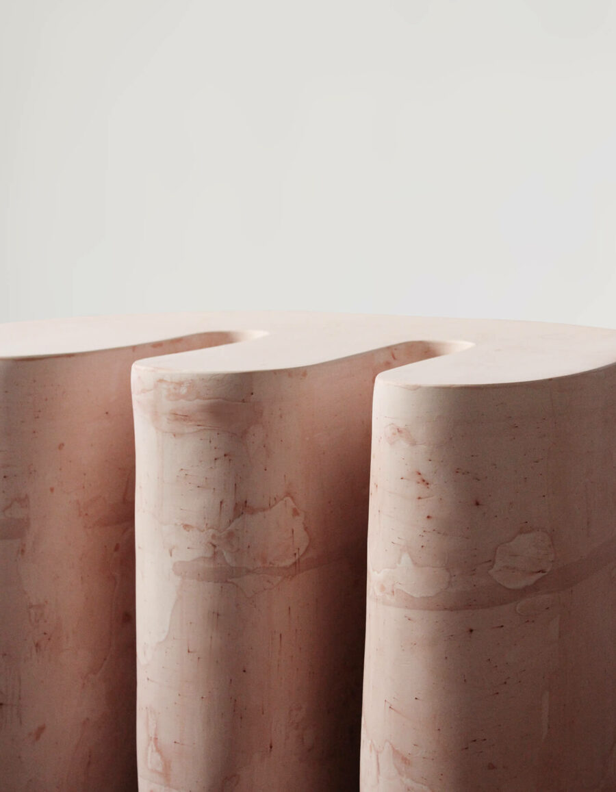
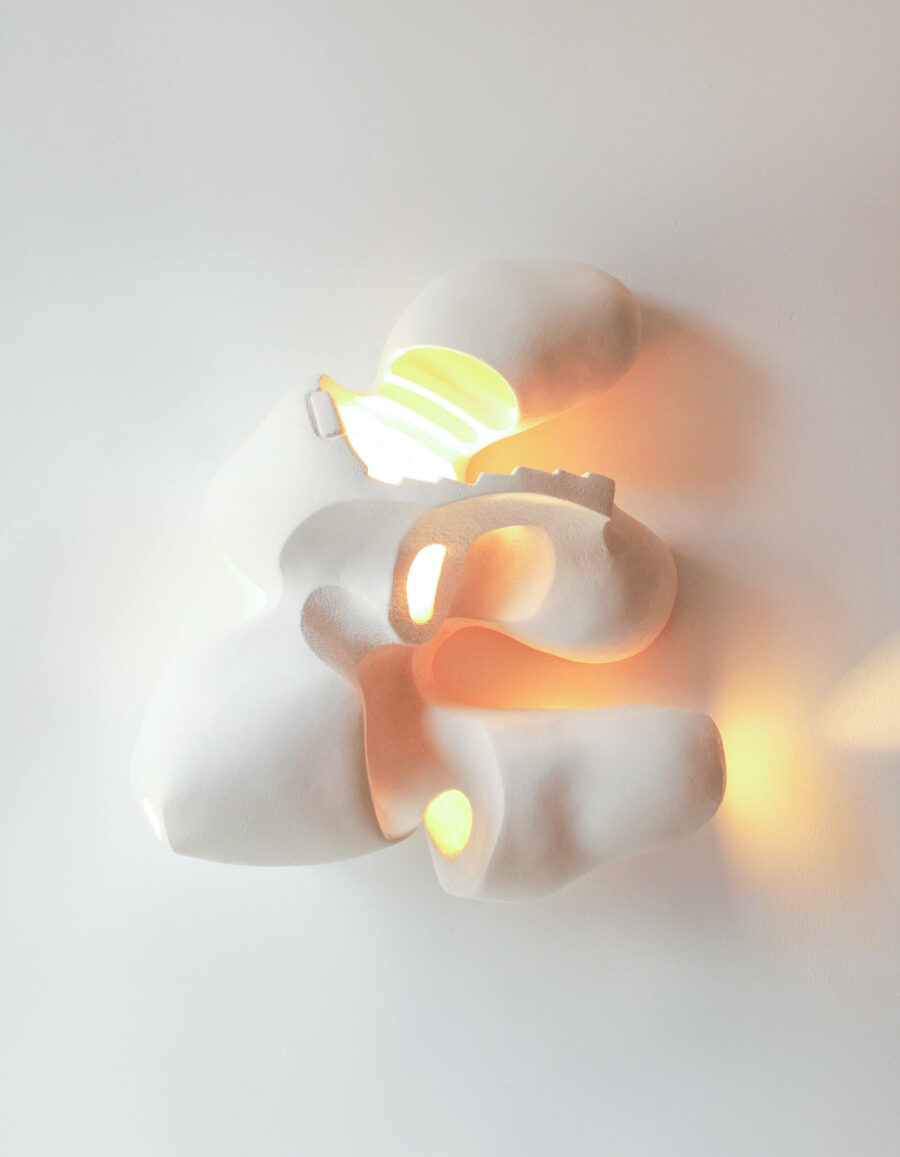
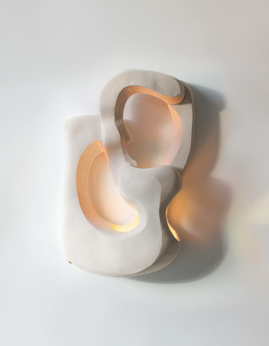
The studio specializes in crafting sculptural pieces, innovatively experimenting with the functionality of sculpture and the essence of furniture. Their work is focused on forging an emotional connection between the object and the user, creating an experience of intimacy and a metaphysical bond. They strive for a meaningful narrative through personal interaction. By emphasising sculptural value and reflective design, the studio’s objective is to create enduring pieces that span generations, contributing to environmental sustainability.